Forms Module
The Form Module is used for creating and sharing forms on a site (see Figure 1).
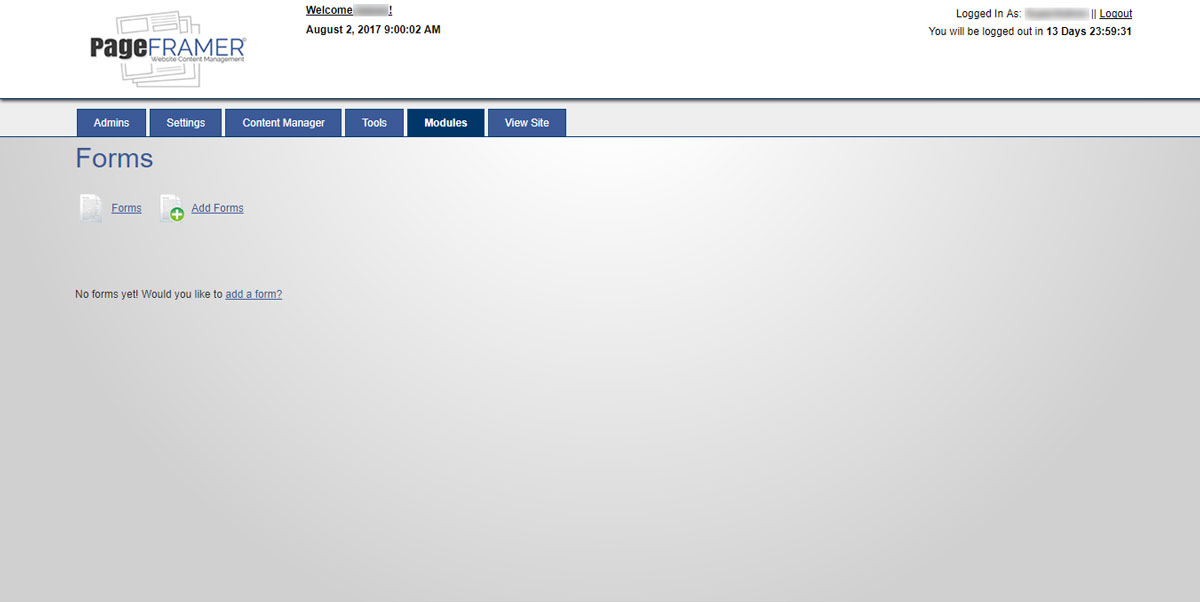
Figure 1
Add Forms
Once you have selected the "Add Forms" icon or text link, you will be directed to the "Add Form" screen (see Figure 2).
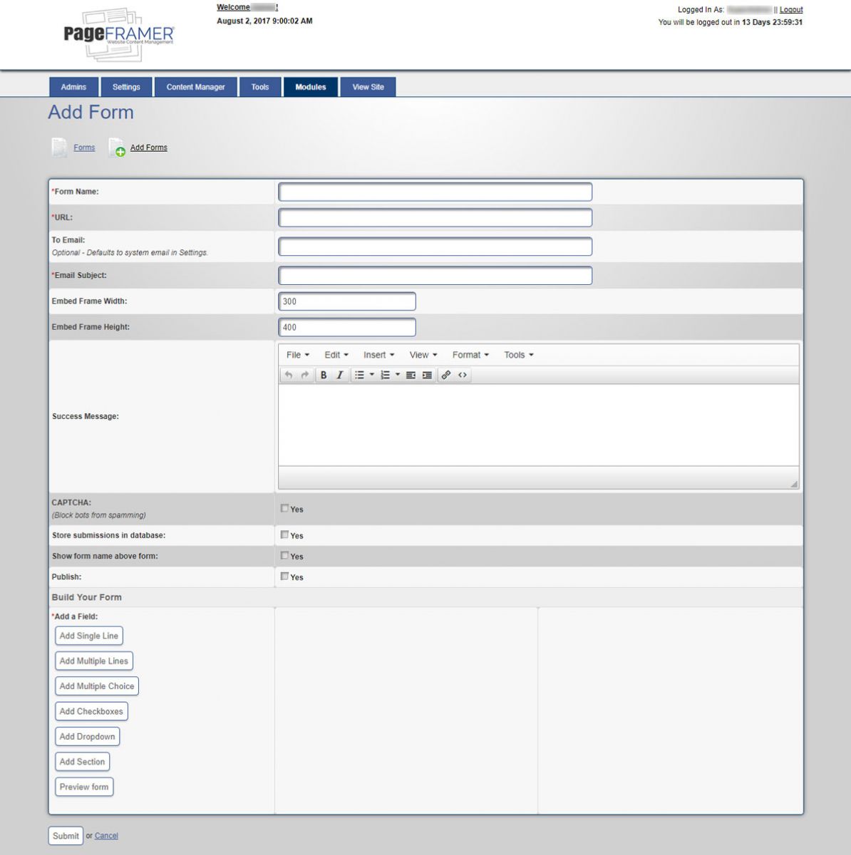
Figure 2
Form Name
You must add a "Form Name" for the category. A URL will be automatically created once you begin typing the Form Name (see Figure 3).

Figure 3
Warning: If you change the Form Name of an active Form you may inadvertantly break the Form. It is recommended you do not change the Name of any active Forms already in use on the website.
Add To Email
You can add an optional "To Email" to the form (see Figure 4). By default the email uses information from the Forms Settings. This field allows you to direct responses to the form to another email if desired.
 Figure 4
All of the fields that have a red asterisk ( * ) are required and must be completed or you will see an error screen reminding you to complete the required field once you try to save the event.
Email Subject
The "Email Subject" field is a required field (see Figure 5). It is common to assign a subject that relates to the form. For example, if this is a "Contact Us" form, the subject might be "Contact Us Form from the website." Feel free to name the subject whatever you wish in order to make it stand out to the person it is mailed to.

Figure 5
Embed Frame Width and Height
By default, the "Embed Frame Width" is 300 pixels and the "Embed Frame Height" is 400 pixels (see Figure 6). These figures can be modified to whatever numbers you choose in order to fill the space where the form is to be added. If you choose 100% as the width, it will automatically fill the width of the container the form resides within.

Figure 6
Success Message
A "Success Message" (see figure 7) is the message that appears to the visitor once they have completed a form. This message uses a limited form of TinyMCE, allowing you to format the response message. Typically, this is a short response that informs visitors when they can expect to hear from you. Most businesses will inform visitors with 2 business days upon recieving the form.

Figure 7
CAPTCHA Checkbox
The "CAPTCHA" checkbox (see Figure 8) adds a CAPTCHA function to the form that helps reduce spam by blocking bots from completing the form. Using CAPTCHA is strongly recommended. To use CAPTCHA, simply select the CAPTCHA "Yes" checkbox.

Figure 8
Store Submission In Database Checkbox
The "Store submissions in database" checkbox (see Figure 9) will store a copy of every form submitted into a database file for later retrieval. To store forms in the database simply select the "Yes" checkbox.

Figure 9
Show Form Name Above Form
The "Show form name above form" checkbox (see Figure 10) will display the name of the form above the form on the page once it has been inserted. Typically the Page already displays the title; however, in some cases displaying the form may also be nessesary. To display the form name above the form, simply select the "Yes" checkbox.

Figure 10
Publish Checkbox
The "Publish" checkbox (see Figure 11) will display the form for everyone to see. This may remain unselected if you wish to edit the form and not post it to the website. To publish the form, simply select the "Yes" checkbox.

Figure 11
Build A Form Area
The "Build a Form" area (see Figure 12) contains all of the fields needed to build a form on your website.

Figure 12
Add Single Line
The "Add Single Line" button (see Figure 13) adds a single line input field into the form. Typically, Single Line input fields are used for first and/or last names, company names, email addresses, phone numbers, and any field that does not require long strings of data. You may select the "Required" checkbox in order to make the field a required field. To remove an input field, simply select the "Remove" button.

Figure 13
Add Mutiple Lines
The "Add Multiple Lines" button adds a multiple line field to your form (see Figure 14). Typically the Multiple Lines input field is used for comments or when long strings of data are required. You may select the "Required" checkbox in order to make the field a required field. To remove an input field, simply select the "Remove" button.

Figure 14
Add Multiple Choices
The "Add Mutiple Choices" button adds multiple choices to your form (see Figure 15). Typically, the Multiple Choices input field is used when you want to allow visitors to select more than one option. You may select the "Required" checkbox in order to make the field a required field. To add options to the Multiple Choice Field, you simply need to click on the "+ Add Option" button to add as many options as needed for the field. To remove an option, simply select the "Remove Option" button. To remove an input field, simply select the "Remove" button.

Figure 15
Add Multiple Choices
The "Add Checkboxes Choices" button adds a single checkbox to your form (see Figure 16). Typically, checkboxes are used for more than one choice, but a new checkbox is needed for each choice, unline the "Add Multiple Choices" button. You may select the "Required" checkbox in order to make the field a required field. To add titles to your checkbox, simply type the value of the checkbox into the "Checkbox Value" field. To remove a checkbox field, simply select the "Remove" button.

Figure 16
Add Dropdown
The "Add Dropdown" button adds a multiple dropdown choice to your form (see Figure 17). Typically, the Dropdown input field is used when you want to allow visitors to select from a list of choices in a dropdown options menu. You may select the "Required" checkbox in order to make the field a required field. To add Dropdown Type to the field, you simply need to click on the "+ Add Option" button to add as many options as needed for the field. To remove an option, simply select the "Remove Option" button. To remove an input field, simply select the "Remove" button.

Figure 17
Add Section
The "Add Section" button adds a section as a division for long forms (see Figure 18). Typically, a Section is used to create a visual separation between segments within a form. To remove an input field, simply select the "Remove" button.

Figure 18
Preview Form
The "Preview Form" button allows you to view the form (see Figure 19) prior to saving the form.
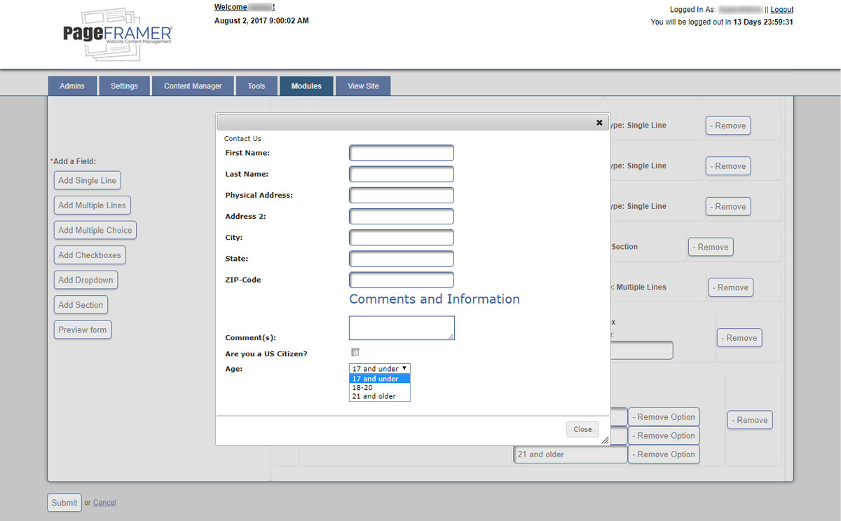
Figure 19
Once you have entered all of the Event data, you can select the "Submit" button to save the Event or select the "cancel" text link to cancel the submission.
Deleting Forms
To delete a form, simply select the "Delete" icon to the right of the form on the "Forms" screen (see Figure 20) prior to saving the form.
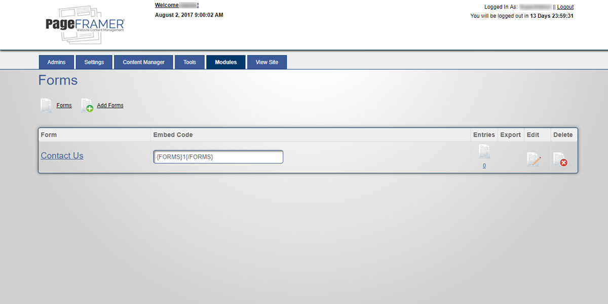
Figure 20
Once the "Delete" icon has been selected, you will be taken to a "Delete Form" confirmation screen (see Figure 21):
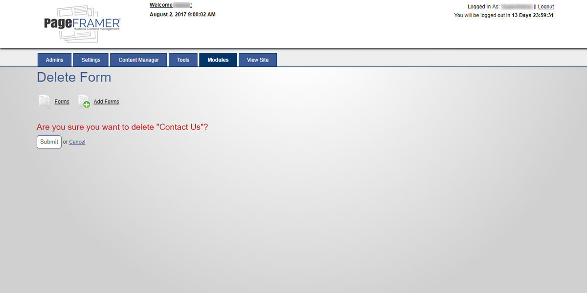
Figure 21
Once you have elected to delete the form, you can choose the "Submit" button to delete the form or select the "cancel" text link to cancel the submission. You will then see a confirmation screen indicating the form has been deleted.
MachForm
Many of our clients use a third party application called MachForm. If your site uses MachForm and you would like to learn more about using it to create forms for your site, we suggest proceeding to the MachForm site to learn about how you can use this application to build and use forms on your site.
